What a beautiful English Tudor. The setting is spectacular! When I happened upon it I thought it must surely be a lovely estate in a small hamlet outside of London!
  Not so, this wonderful treasure is located on almost three acres of rolling hills in Greenwich, CT - a suburb and only 45 minutes outside of NYC.
 Let's have a tour! You enter through a gorgeous stone entry with a beautiful, arched door.
 Your first stop is the library/entry hall. Take a close look at the detailing of the walls. I love the secret wall of books that swings open to reveal a doorway. Also look at the staircase through the doorway.
 Here is a closer look at the staircase. I adore the railing and soft curve.
 A glass and stone gallery leads you the living room.
 The house is filled with period mouldings, leaded glass and limestone fireplaces.
 I love the family room and the wall of french doors which invite you to enjoy the spectacular view. Notice the coffered ceilings.
 The architectural detail in the dining room is sublime. Notice how the windows are not only trimmed out with molding, but also boxed out with column like detailing. This creates deep transitions to windows. I especially like how they kept this room white. You can enjoy the detailing with out being overwhelmed by it.
 Despite their reputation, Tudors can be light and bright. Here the kitchen is done in white with marble and wood counters. Clearly it has been updated and renovated over the years. I like the shape of the hood.
 The nearly untouched Great Room is perhaps the home's most dramatic. The striking fireplace and wood beams are wonderful. Notice the curved floor to ceiling window.
 I love to see old homes restored to their original grandeur. The home is currently for sale. To see more of it click here. And if you end up becoming the new owner, let me know and I will drive down from Boston for visit!
(all photos Sotheby's)





 Another bedroom on the third floor located in the wonderful attic boasts arched casement windows. The zinc topped table was designed by Linda and her shop, Simply Home.


 The second kitchen in lighter tones has a more relaxed look. Notice that the space and layout are almost the same but the feel is very different.
 Notice the upholstered chairs, chandelier and pendant lights, all would be equally at home in a dining room.
 The other unit had a formal dining room, so the kitchen was designed to have a more relaxed, informal feeling. By choosing warmer wood tones and wall colors you immediately can see this space has a completely different feeling than the kitchen above. It is interesting to note that the backsplash and counters are the same marble as the kitchen above.

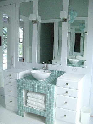 Almost every one needs more storage in their bathroom. Perhaps we all need to get a bit more organized, but if you are clutter challenged like me, I wanted to show you some wonderful baths by designer, Molly Frey. You may remember a previous post on a fabulous coastal house by Molly