Sunday, February 28, 2010

Before and After Party! (A drape redo)

027

Well hello! Hope you had a wonderful weekend! I was busy keeping Kleenex in business with a lovely cold. :)

I did get a bit of work done on the basement – I could actually breathe much better down in the cold! It’s going to take quite a bit more time and a ton more work, but I am SO excited about the changes down there. The amount of crap we had has been a bit overwhelming, and getting it out of this house has been such a fantastic feeling!

So onto this month’s Before and After – I am pretty much done with the family room (mini) redo, and I’ll show you that whole space soon. There was one last part that was bugging me – the drapes.

I get a lot of questions about these drapes and I think many go “ARGH!” when I email them back and tell them I actually made these myself. ;) I started with the brown diamond patterned fabric as drapes, and then decided a few years ago they needed a little sumpin sumpin. So I found a coordinating (and much more expensive) fabric in a tan/wider diamond pattern and added it as a panel to the bottom:

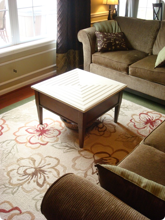
I adore these drapes. Lurve. I was contemplating new window treatments in here though, because there were a couple things that had bothered me about them as I reworked the room. The obvious was the diamond pattern just didn’t look right to me next to the new rug. (As you can see a bit in the pic above.)

The other thing that has bothered me from pretty much the day I put them up is they never seemed to hang right. I always felt like they should look fuller than they did. They also covered a little more of the window than I really wanted.

There are two things I always suggest to folks about drapes – hang ‘em high and hang ‘em wide. High and wide gives the illusion the windows are bigger than they really are. I usually suggest hanging the rod far enough to the side of the window so the window treatment will only cover about four inches of the actual window.

This allows for more light, and again, makes the window seem wider. Which is never a bad thing!

Well, my drapes were covering way more of the window than I wanted. Not sure why I did that, or why I hadn’t fixed it yet? But staring at them the other day, I came up with a solution to all my issues. And it was FREE!

First, I took down the drapes and just shortened the rods by five inches. I used my miter saw to do this, but the first time I cut these to 24 inches each, I used my little miter box and saw and it worked like a charm. 

The finials had a brassy tone that I wanted to get rid of, but I didn’t want to have to replace the whole set. So I just taped the brassy sections off and sprayed them with my ORB paint:

021

I love them all over again! (Like I did five years ago when I bought them!)

Once I got the hardware rehung, I went ahead with my wild and craaaazy idea and just flipped the drapes and hung them with the panel on top. I stepped back to check it out…

011

And luuuurved it! UH DUH. Why didn’t I do this from the start??

Flipping these did a few things – it made the bottom of the drapes way less busy, and the brown matches the brown tones in the rug really well.

It also made the gorg diamond fabric the showcase of the drapes, as it should be:

012005  

I love, love, LOVE this fabric:

035

I would totally wrap myself up in it at night, I love it that much. But it’s not cheap. (I think $40 a yard at Joann’s?) So there will be no wrapping in this stuff. ;)

Then I used my usual tried and true drapery tricks to finish up…

I keep the outside drapery rings between the finial and the bracket so when fire trucks and trains are driven under the window treatments by a sweet little three-year-old, they stay put:

017

And I hung them from behind with the drapery clips, creating the folds like this:

019

Try that trick – if your fabric is thick enough and long enough, you’ll never go back to hanging the drapes down from the clips again!

I had to use flash in most of these pictures, so I apologize for the poor quality, but this one shows you how much of the window is covered by the drape. I like to use the window panes (if you have them) as a guide:

044

Half of one pane is what I typically do. Oh, and please ignore the deck furniture that has been stacked and ready to go in the garage for the past four months, umkay?  :) Priorities people.

Shortening the rods made the drapes hang SO much prettier:

015

They just “pleat” so much better now!

I. love. it! And did I mention? FREEEEE? All of the updates – cutting down the rods, rehanging them, spraying the finials and hanging the drapes again took about an hour. Not bad at all!

So here we go! Here’s the before from years ago – with the white two inch blinds, wider rods, and the panel of fabric on the bottom:

And here’s the after – bamboo roman shades (from last year), shorter (debrassified) hardware and the panels at the top:

045  

You like? I still love them either way, but I love how I made them work with the other changes in the space. I am keeping my beloved drapes! Yippee!

Now it’s your turn! Grab the button if you’d like:

beforeAndAfterButton

Then make sure to copy the link from your post into the linky (links to your blog address will be deleted). All you need to link up is a before picture – it can be any kind of project you want to share!

Have fun and thanks for joining in!

Time to Smell the Roses...

This photo was taken of my and my girl almost five years ago. I have decided it is time to take another ride on a carousel and this time she won't need me to hang on to her.

All the more reason to take another ride...

Indeed, I am hooking up with my sister and her little one later this week and we are going to shop for shoes, swim and have a girl's sleepover in a shared hotel room. We are going to eat somewhere "fancy", drink Starbucks (us) and wear matching bathing suits and jammies (them). We are going to ride that carousel, take photos, and make memories that we won't soon forget.

Besides, who needs elaborate trips to Disney when you can have the fun that we are going to have?

(and we won't be asking the girls that question...)

Coastal New England Ocean Oasis

One of my favorite parts of writing Willow Decor is getting to know the many other talented designers, architects, artists and residential photographers that make these beautiful spaces come alive. Meeting photographer Jamie Salomon was one of these special connections. Whether you are aware of it or not, you most likely have already seen his work. It has been featured in many magazines including, Coastal Living, Better Homes and Gardens, New England Home and several others.
He shared with me this wonderful cottage renovation on the New England coast. As you can see the home is located out on a peninsula. At high tide it becomes an ocean oasis. Though small, it is filled with everything you need to relax. The main room above features a kitchen nook and desk area.
Decorated in soothing whites and grays it is impossible not feel your tension rush away with tide. 
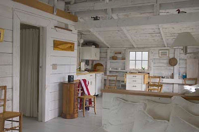
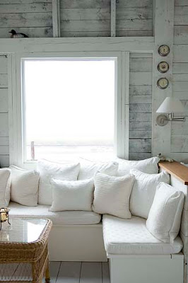
The cottage is sparsely decorated; intentional so you take in the spectacular ocean views. Here is the couch area from a different angle. I love the whitewashed walls which remind me of sun -bleached driftwood.
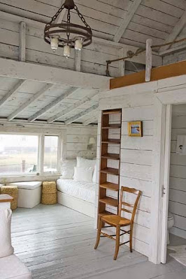
Opposite the seating area is a ladder to the loft above and a daybed tucked below. As you can imagine the views from every direction are breathtaking.
Here is a close up of the daybed overflowing with soft pillows. The wonderful sconces provide just the right light for curling up with a good book. 
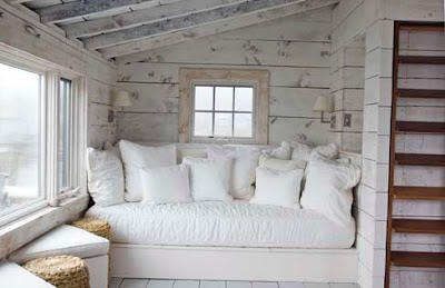
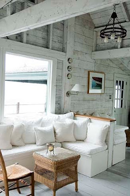
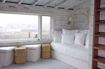
With this view I am quite sure I would never leave - it gives a whole new meaning to word "bed-rest"!
Except of course to sit out on the deck and cast my line - Perhaps fish for dinner??
Have a wonderful relaxing weekend!
To see more of Jamie Salomon's work click here.
.
(photos J. Salomon Photography - not to be copied with out permission)
Never miss a post!! To subscribe to Willow Decor click here

Dots

Just nu befinner jag mig i Århus- Danmark.
Igår var vi på stan och besökte flera fina inredningsbutiker, bland annat HAY. En av mina danska favoriter...
Bild: Hay.dk
Här kommer en bild på deras fina kudde Dots Cushion. Tänk ibland vad enkelheten är vacker! Du har väl inte missat att blått är det nya svarta...
Vi ses igen imorgon!
Kram Sofie

Saturday, February 27, 2010

Red Kitchen Design Ideas

Red Kitchen Design Ideas

Experimenting with colors are a never ending experience and fun. Colors are world to conquest. Now we present you with red kitchen design. Red is the color of passion and fire, it also representing the color of bravery and courage. It’s ideal for romantics and extroverts.Island Kitchens
Mobalpa Heliante Red Kitchen Design
 kitchen cabinets
Modern Kitchen Designs
As you can see at these designs they are all advancing in color which makes you feel cozy and inspiring yet challenging. When you design your kitchen in red color for the wallpaper, or for your kitchen cabinets and maybe a little extreme is to design as whole in red then you will get your appetite start stimulating.Modern Furniture Design
 kitchen ideas
 Red conveys elegance and style and although it can achieve impressive effects should not be allowed to be the dominant color in the kitchen. Get ready to sizzle up with this kitchen design coming to your house. It is not challenging if your kitchen isn’t red!Modern Kitchen Lighting
kitchen islands 
kitchen decor
modern kitchen design 
kitchen furniture 
kitchen furniture
Modern Kitchen Design
luxury kitchen 
luxury kitchen
Kitchen Design Ideas

Kids Bedroom Design by Karim Rashid

Kids Bedroom Design by Karim Rashid

kids bedroom furniture
Every mother in this world certainly wants their kids to be happy. But what does it take to make them happy? Well for a start you might take a good look of this futuristic bedroom interior design along with the bed furniture by Karim Rashid. The shape is extra ordinary, and for this  extra ordinary bed comes with extra ordinary named of Neoset.Bedroom Furniture Collection
kids bedroom accessories
Neoset is so colorful with a cutting edge and fun design for your kids to have. Neoset features twin and bunk bed, storage shelving, drawers and some fun decorative element which makes your kid able to take on a journey to the future. To give you extra and more specific details you can visit Karim Rashid web to see more arts. I reckon this is more than just a bedroom, it’s an abstract and it’s an art.Italian Contemporary Bedroom
pink kids room 

Contemporary Modern Fireplace

Contemporary Modern Fireplace

electric fireplace
Warm living room is what most people want, especially when the cold season is around and being inside the house is the best option to have. Designer Jacob Jensen has created the contemporary wood burning stoves which he designed with three models: Vision I, Compact Vision II, and Wall Mounted Vision III.Art of Interior Designs
fireplace design
Vision comes with window-rinsing function, in which a stream of air prevents soot from forming on the interior of stove large panoramic window, and a simple control panel that can be used to regulate the combustion. Vision comes with its maximum 8 kW heat output and tight, clear design, making it as the perfect furniture for your home interiors.Modern Furniture Designs
stone fireplace
modern fireplace
modern fireplace
Modern Furniture Design

Winner!

125ad_dimples2

Hello all! Thanks so much for all the funny and sweet entries for the Dimples and Dandelions giveaway! They were SO fun to read. Kids are adorable. Good thing, eh? :)

Anyhoo, the winner of the $50 gift card is Jude from Dolce Cape Cod! Jude, please email me (thriftydecorchick (at) gmail (dot) com) and I’ll get you connected with the Dimples and Dandelions folks.

I know I promised you all a post on the stairs this weekend, but I was hit with a lovely cold yesterday and it’s getting worse by the minute. I cross my heart, stick a needle in my eye promise I will share the how-to on the stairs early next week. For now, I must drink hot chocolate. And make soup. And sleep. ;)

Don’t forget about the monthly Before and After Party on Monday! (I’ll probably have the linky up late Sunday night.)

beforeAndAfterButton

Have a great one!

Skön harmoni med detaljer i trä

Det här huset var från början ett stall men har byggts om till en ljus modern bostad. De härliga bjälkarna i taket behölls och sätter en speciell karaktär på hela hemmet. Trämöbler i både olika träslag och tidsålder gör att totalintrycket blir en skön harmoni. Bilder från stylist Katrine Martensen-Larsen, fotograf Kira Brandt. Via Desire to Inspire. Du hittar fler bilder här.
.

 
coompax-digital magazine