As I get through all of the consultations you lovely people have purchased, I find it hard to describe how to decorate one of the biggest focal points in any room -- the fireplace. Those of you lucky enough to have them need to make them a highlight, the "Supastar!" of your room.
To show you all what I find to be a great mantel -- I started looking around a site I haven't been to in quite a while -- HGTV's Rate my Room. And didn't find one. single. mantel. that I thought showcased a really great one. (Granted, the computer is like molasses tonight, so I didn't look that long.) I ended up finding some great inspiration elsewhere, so hang in there with me...
Our mantels are a bit odd in this house -- I thought having a corner fireplace in the family room would be totally fab, and it turned out to be a royal pain in the you-know-what. It is nearly impossible to decorate to my liking because of the large space up there. It can't be decorated traditionally like I would like:
Years ago I added the molding and iron work and love that, and do like how it looks currently. It's just not what I would love to do with it.
Our bedroom fireplace you've seen one meeeellion times:
 It is very, very long and not very thick, so it doesn't allow for a whole lot of options. I've thought about making the mantel a bit thicker so it would hold more. I wanted the look to be simple in this room anyway, so I'm happy with how it turned out.
When decorating yours -- keep in mind your eye should travel up and down as much as possible. This allows your eye to comfortably look at the fireplace and is most pleasing. There is a decorating trick called, "Three Plus One," that is a great one to keep in mind when finishing off a mantel with accessories. I copied this explanation from here because it said it perfectly:
For the "Three" part of the "Three Plus One" scheme, select three related, similar objects and place them on one side of your fireplace mantel. The three objects should not be of identical height, but, then again, they shouldn't vary too much in size.
Perhaps three candles, three framed pictures or three decorative plates would be just the thing. When you group your three selected objects on one side of the fireplace mantel, don't line them up like soldiers. Think in terms of layering. Experiment with bringing one forward, one visually overlapping another, or tucking one a bit behind another. Instead of having the three objects face straight into the room, experiment with having them face a bit toward the center of the fireplace mantle.
Don't cram the three objects all the way to the left or right end of the fireplace mantel. Leave a bit of space after the last object so the end of the fireplace mantel serves as an edging for your grouping.
For the "One" part of the "Three Plus One" trick, select a large object and place it on the other end of your fireplace mantel. As a rule of thumb, this singular object should be either about twice as tall as the threesome of objects or have the "visual mass" of the three objects. If you go with a tall object, it should not be as tall as the top of your mirror or painting.
The one large object may have something in common with the three objects on the other end of the fireplace mantel. Maybe it echoes a color or a texture or a shape or a theme found in one or more of the objects at the other end of the mantel.
Perfect! Does that make sense? Of course, this is not the end all to decorating a mantel. I found a few pics online I thought worked well:
I'm not a huge fan of the reflection mirrors create above fireplaces, but I love the effect of the framed art layered on this one. It is decorated for Christmas, but I actually like the greenery on here -- love the texture!
If you are a symmetry-freak like me (I try to break free of this! It's soooo hard!) this example is right up your alley:

I think it is just about perfection -- the art fits exactly right and the accessories are tiered at just the right levels.
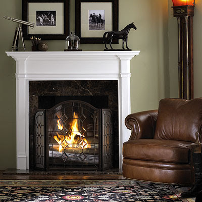
I also love this one -- a bit of symmetry and a bit of height variation:
And that screen -- ohhhh I. love. that. screen. If you look close, you'll notice the frames aren't exactly the same size or orientation. I love that at first glance, they look like they are.
Well, of course, after spending an hour searching online, I remembered some of the mantels of my bloggyidols friends that are exactly what I try to explain in the consults:
Well, of course, after spending an hour searching online, I remembered some of the mantels of my bloggy
 Kimba's summer mantel made me swoon. I would not change a single thing about this one. The sailboat is divine.


